As graduation is extremely close now I have started to look for jobs both in and outside the game industry but mainly revolving around 3D modeling or QA. I have all the skills that are required for most jr positions but looking at the standard positions I realized that I need to improve my traditional art skills. Mainly sketching more to give me a greater understanding of the composure of objects and improve how I annalise an image then brake it down. I also need to work with more sculpting software like Z Brush and Mudbox as my knowledge of these software’s is basic at best and they are requirements for most asset/ product design jobs. I have decided to explore jobs outside of games as well based on the experience I had over summer when I worked at an architects because this made me realize just how transferable my skills are. If I eventually do want to exclusively work on games I can build up my portfolio and experience while working in another 3D orientated job.
To fulfil the brief for this project I started by proposing a suitable project to my tutors that would span the whole year, I also had to set the goals the project must reach for it to pass. These goals were: primary goal, create 2 – 4 character designs, create stage concepts based on characters, choose one idea and refine, create foreground, midsection & background for the fighting stage, secondary goal, create GUI, add movement and interactivity to the stage, tertiary goal, get custom characters into the engine, add character animations. This would all amount to the creation of a fighting game stage. This proposal is much more suited to the area of design I want to go into as I want to specialise in 3D modelling, mainly the creation of assets. The original proposal I made was for a story heavy mystery game that was very dependent on coding and writing two areas which are my weaknesses and not what I wanted to do that is why that proposal was dropped in favour of this one.
I started the project by doing research on fighting games by reading what people thought made a good fighting game in forums, as well as playing a variety of different games to find my favourite style and rules. I then took this information and brainstormed ideas for story settings and a world to develop my characters in. I decided to go with a futuristic setting in a world where oxygen is running thin and most of the planet is dying. Corporations monopolise oxygen and use it to have power over the citizens. I chose this because it felt more unique than the other ideas I created and would allow people to have conflicting views depending on their social standing. I then began to sketch my characters, I created 6 characters in the end, 2 more than the proposes 2-4, however the quality of the characters was only at the initial idea phase with very little development this is due to poor time management on my part as I started a volunteer position at a local architects firm and worked there almost every day of the week, because of this I tended to put off doing sketch work in favour of relaxation after the 9 to 5 shift. In hindsight I should have brought my sketch book with me and worked on my designs over lunch hours or if there was a drop in work. However, even the basic character designs served as enough information to design a stage based off of each of them these stared as small thumb nails and was meant to be more of them, but once again due to my poor time management over summer I stuck with the first design for each character and worked them all up into a full page design by this point the term had started and I was working in university again. I used this to my advantage and asked my peers for feedback on asset lists, I made one for every stage to see how easy each stage was to think of things to populate them with. I also took a vote on my three favourite designs, which I worked up even further in Photoshop, to see which people would like to see created the most. The lab stage design won, however I feel I spent far too long on this part of the process and think that I could have resolved this in one week, instead of three, I ended up dragging it out to add tweaks to the Photoshop designs and waiting for everyone to vote before making a decision. Those two weeks could have been put to better use creating assets or focusing on client work.
With the lab stage chosen I started to create the space in UE4. I used images I created in the Photoshop document to create alphad plains as place holders. This worked great to quickly populate the space and allowed me to see visually what drew the most attention and should be replaced first. However the first attempt at creating the space was tiny and up to the knee of the default character, this is my fault for starting the project in a blank document that had no character or starter content to use as reference. I should have created the project in a third person project this would have saved time migrating over content from another project. I measured the length of the stage based on research I did while playing fighting games and made the stage 32 character widths long. I got this number by playing a two player match against myself and hopping the characters over eachother.
Asset creation was a fairly quick process however the texturing took some time, this is because I was using UV mapping which requires a unique material to be made for each asset which is extremely time consuming. After Easter I swapped over to atlas mapping were you unwrap the object to the texture map creating a material that can be used by several assets. This saved me hours in texturing work and allowed me to produce assets with materials at a faster rate moving my output per week from one asset to three/four (on average).
One technique that sped up the creation of my project was parenting, by using parenting I could create all of the assets in one 3Ds Max document and place them were they needed to be. I then zero out the axis of that object and export it, usually this would be bad as the axis point would be far away from the model in engine. However, by parenting this object with something like the wall you can zero out the axis position in the engine and it will move the object to the exact position it was in the Max document making for very quick and precise asset placement.
I feel that the quality of my work has come a long way and I can model things much faster than I could last year, this combined with new techniques has made my end products much better. However even with atlas mapping I still feel that my texturing could use some work because I still seem to judge the strengths needed on normal maps wrong and end up with results that are too intense as well as darker shadows because of intense ambient occlusion maps. These can be addressed in Photoshop quite easily, however, I still feel my knowledge of physical based rendering is lacking and there are several nodes in the texture set up I have never used. I also need to look into masking to give me a greater control over each material. The last thing that needs improving with my modelling is light maps because UE4 builds them automatically I haven’t progressed any further in creating my own as there has been no need most of the time just flattening the object on the second UV channel will be enough to fix all errors if there are any. The problem with this is that the models are left with less light map resolution as the UV islands are smaller than necessary and could be placed much more optimally manually.
Due to my lack of knowledge in blueprint and texturing nodes I failed to make a post processing cel-shader for my game and had to get help from James Cook who managed to produce one for me. By this point I was feeling more confident with the amount that I would have finished and added playability in the form of the default UE4 character. However I disabled his ability to move on anything but the X axis and mapped the jump button to the up direction so it would mimic the controls of a fighting game. I added two blocking volumes at both ends of the stage then compared the time it took for my character to move from one side to the other to video footage I recorded from another fighting game (Guilty gear). It took my character 3 seconds and 8 seconds on the game so I slowed the character down to match this speed however, the UE4 character looks like he is moving really slow this is because the walk animation set up is not spouse to be played at this slow a speed and is why it looks clunky. I also lowered the jump height so the player could no longer jump above the balconies.
Once I had created the security camera and the TV I asked for help from James Cook and Phillip Maclennan for a blueprint that would allow the camera to follow the player’s movements and display what it is looking at on the TV’s screen. This worked however I soon realised that I could not leave the area of the stage behind the player’s camera empty as you could see the empty space on the camera display so I grey blocked it using BSP and applied the same texture as the walls have. Though this is a quick fix the players view is far enough away from the screens that it does the job and you can’t tell that the tiling is different on the BSP to the walls I created.
The lighting rig that I created used the ceiling plane as reference for the size however this did not work when I tried to place then in the space as the lights crossed over the stairs and when they were moved further back was not in the cameras fiend of vision. To fix this I scaled the lighting rig down to fit more centrally between the stair cases and removed two side panels as they looked out of place now the light rig was free standing and not next to a wall. I am happy with the way the lights have turned out but if i was to do them again I would plan out everything that touches the ceiling and make the lights work around those from the start instead of messing with scale and position.
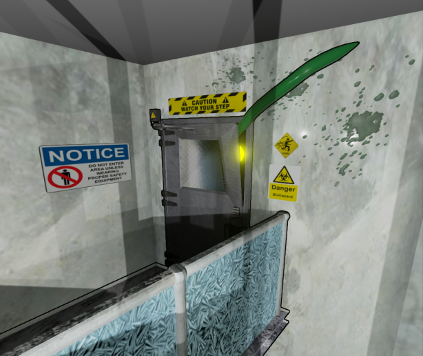
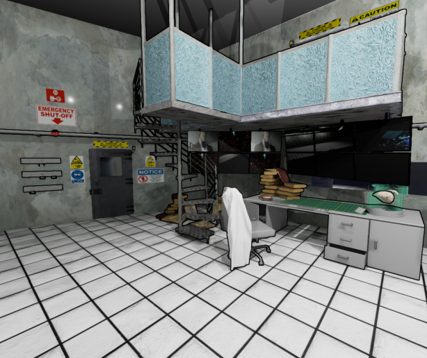
To help bring the space to life and fill the empty walls I decided to add piping running around the room with red valves placed at certain points. This worked well and gave me the idea to add signs around the lab, I tried to place them in places that made sense and would add narrative to closed doors. One sign warning about Cthulhu inspired me to make a broken version of my door and have animated tentacles wiggling through the gaps with a glowing yellow sphere as an eye. I think this is a great feature and has become a key focal point in my environment. Once this feature was done I learned how to use the cloth modifier to make a tessellated plane mesh hang on coat hangers and a chair like a coat would to create the illusion of a lab coat. I think this has worked well and ads some narrative to how many people may work here and how they leave there coats.
As the deadline for the project grew closer I set a cut-off point and quickly modelled the last of the missing assets without texturing them. I them got help from Phillip Maclennan to help me set up a stage opening cut scene this turned out great and then he helped me create a timer and set up the place holder for the health bar so that I could replace it with my own art work once that is completed.
I then started to work on the design document giving myself just around two weeks to wright it. I was shown how to use Adobe InDesign and used it to design my document more like one of the fighting game art books I purchased for research. This gave much more time to think about what I was putting in the document and make something that was well thought out and looked aesthetically appealing. I do however wish that I had started it at the beginning of the year and filled sections out as they were created but I don’t think I have suffered too much for it this year because of the two weeks I allowed myself to complete it.
Overall I feel that the project was a success I managed to create a fore ground with the test tank on the same level as the player. A mid ground with everything on the walls and all of the assets in front of them and a back ground with failed models of the medical pod in a dim lit room and some 2D assets in a back room. I also managed to create six character designs however I do wish that they were developed to a higher quality. The same can be said for all of my sketch work, if I was to do it all again I would have made several variations of everything and made sure each idea was explored more thoroughly. I also managed to create a stage from the concept I created based off of the scientist and develop it in 3D to the final thing. I also managed to start working on my secondary goals and have the frame work for a GUI.
One thing that could have been improved was the schedule that I made and tried to uphold at the beginning of the project. I ended up not sticking to the allocated times and prioritising my dissertation and by the time I handed it in I was already staying while the building closed so I decided just to work on what was most urgent while I was in the building. To improve this I think I should have just allocated the time as work time and not into the different subjects as prioritising jobs by how far along they are or how urgent they are to finish worked. My favorite part of the project was creating the later assets to add more narrative and personality to the environment. My least favorite part was blueprint; however, this is because of my lack of knowledge in this area. If I was to do the project again I would have looked into blueprint more over the summer so I didn’t have to rely on others all the time to achieve everything I wanted to in this area.
Overall I am extremely pleased with the outcome I was able to achieve and plan to finish texturing the rest of the assets and perfect the GUI for the degree show.
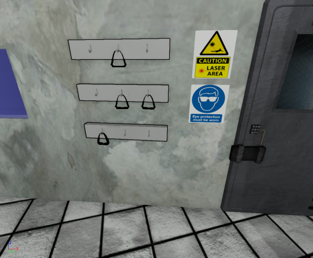
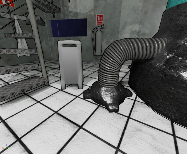
With things coming to a close I decided to model the final assets i intended to create. The wet floor sign that was pointed out as something you look for in a lab environment out the way. A fire extinguisher because they are used everywhere and the goggles to go next to the goggles sign.
I hope to fully texture these by the degree show.
I was inspired by a sign I saw that was warning you about Cthulhu and decided to create a scene in the level based around this. I pictured a door bent out of shape and tentacles coming through wriggling with a glowing eye. This is what I tried to create which was tricky because I had never imported an animation before however, after a bit of trial and error I found out that you just had to import the animation and the bone separate then attach them in the engine. I am happy with the result but consider it a starting point by the degree show I want to have more tentacles to make it look more imposing.
To help bring the lab to life I gathered a selection of relevant signs and placed them in around the stage to add narrative. this included giving blank doors signs that indicated what could be on the other side like lasers, flammable substances or bio experiments. this also gave me Ideas of what to make next like fire extinguishers near the fire extinguisher sign goggles to go next to the goggles sign etc. Doing this has really brought the environment to life and I wish I had done it much earlier in the project.
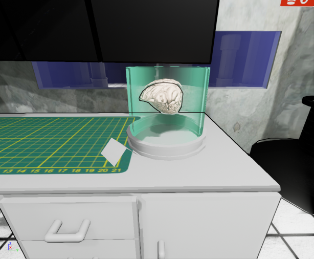
for the table and chair I decided to go with a modern feel and tried to give the chair more hard edges. I like the effect I produced and had a lot of fun adding dressing to the table and chair. I used the cloth modifier to drape a cloth over the chair to simulate a lab coat. I also piled up books, a cutting board and added the brain in a jar that someone requested. I also put all of the blood bags I created in the bottom draw as they looked out of place piled in the corner now that the stage has taken shape.
I remember watching a video on fighting game interfaces in the first year and re visited it.
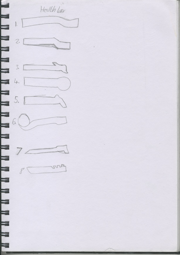
after watching the video again I started working on my health bad designed trying to make it visually obvious when the players health falls below 25%. This is important so the player only needs to glance at the health bar to know how well they are doing, this allows more focus to be put on playing the game. I hope to refine these designs and have a finished GUI design that also includes the timer, energy bar and round points for the degree show showing of my project.
Game Jam Manic Moles.
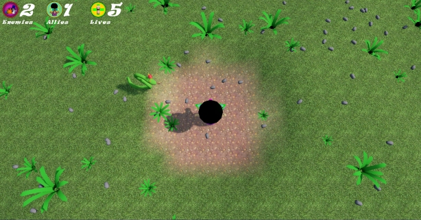
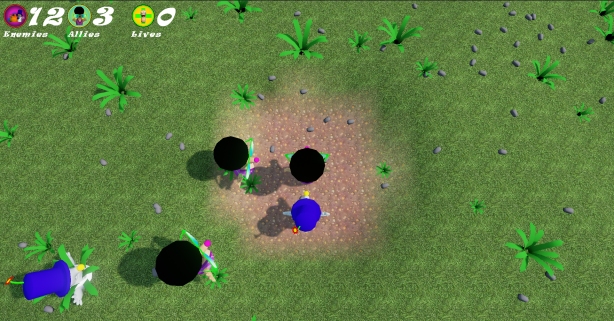
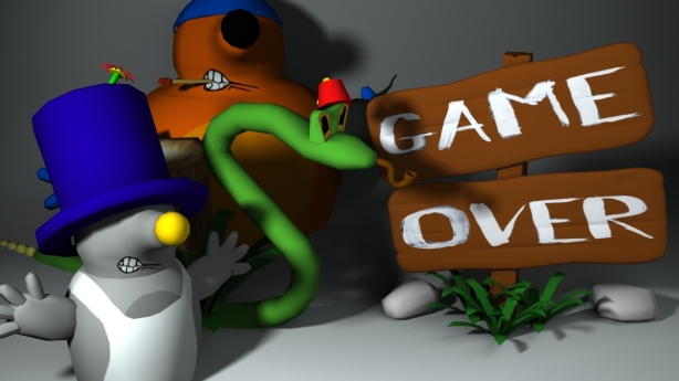
Posted: May 23, 2015 in FMP, Personal, Professional Practice, Year 3 Client ProjectManic Moles was created by myself, Phillip Maclennan, Jason Pook & Shane Pengelly for the 2015 Hsad game jam. The objective of the game jam was to create a game for mobile with one mechanic, one character and one environment. We spent the first few hours planning what game we should make and if it was possible in the time we had in the end we went with the idea that would become Manic moles. My role in development was asset creation I was given the task of creating a snake this was an easy task becasue we decided to go with a flat colour style so texturing was a quick and simple process so I had some fun and created a pipe and fez to make the snake more of a character. Everyone decided to add fun little details like this to their characters so it became part of the games style.
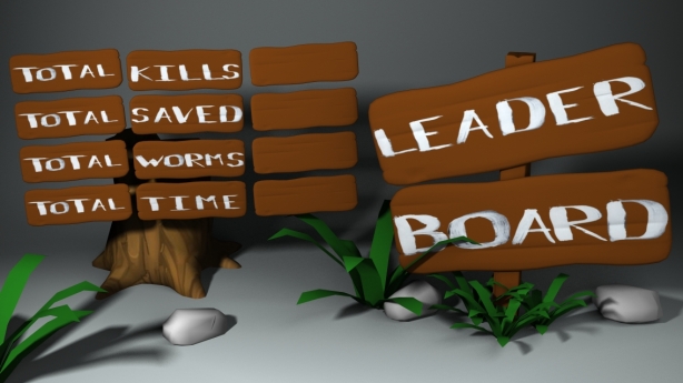
I also created the grass, rocks and signs. The text on the signs was hand painted by Phillip Maclennan scanned in and added to the texture in Photoshop. I then worked with Shane Pengelly to create a sound track for the game using software on the Macs this was only a five second loop however it does the job to make the game feel a bit more polished rather than it just been silence. My last job on the game was creating the start, game over and high score screens for the game. I did this using 3Ds Max and a three point light rig set up.
Overall I am pleased with the game and think that with a little more time we could perfect it and put it on a mobile store. The game jam itself was well paced because we had done the planning right and evaluated out skills to the time we had available we were able to meet our goal and do much extra then we expected.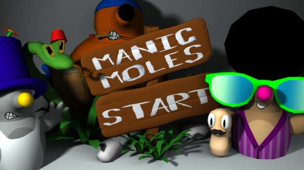
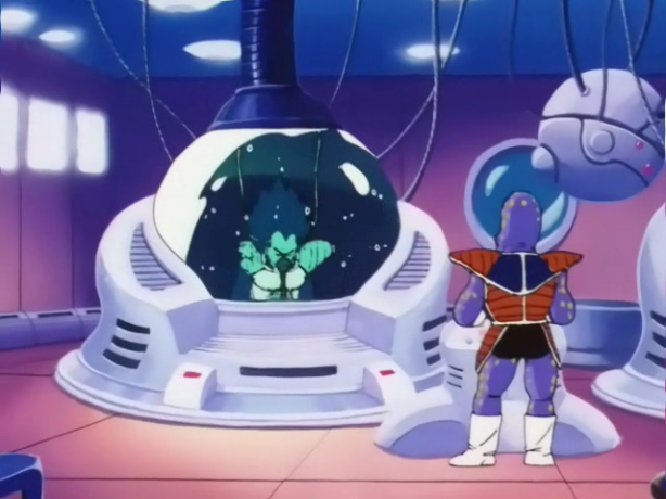
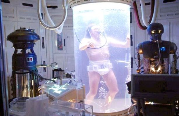
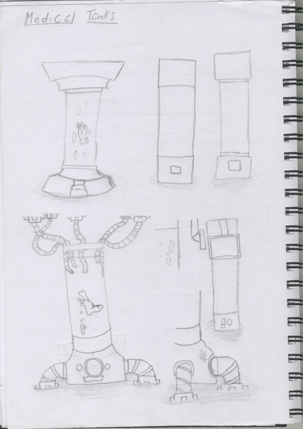
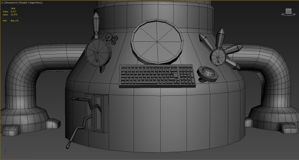
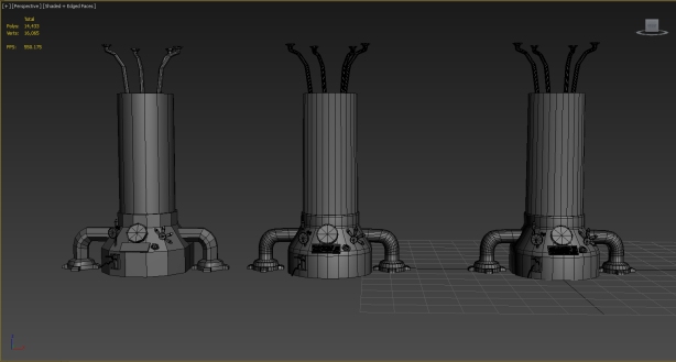
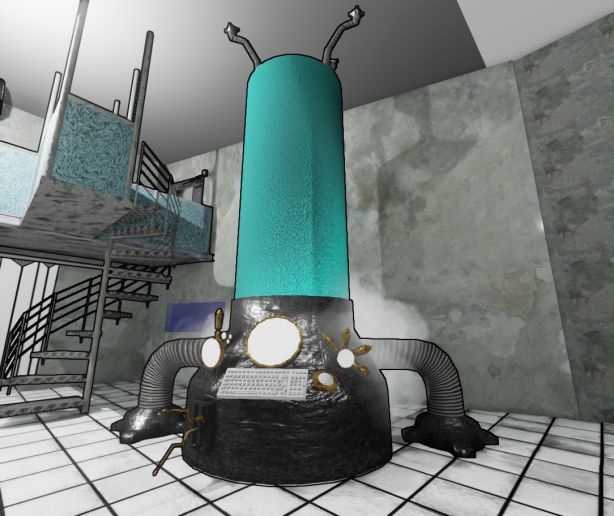
While thinking about what to have to make the lab feel more like a mad science lab I instantly thought of the healing pods from Dragon Ball Z and the bacta tank from Star Wars and have something like that running tests on flesh, organs or limbs.
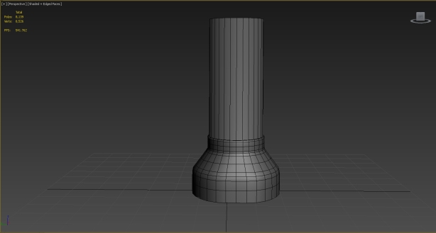
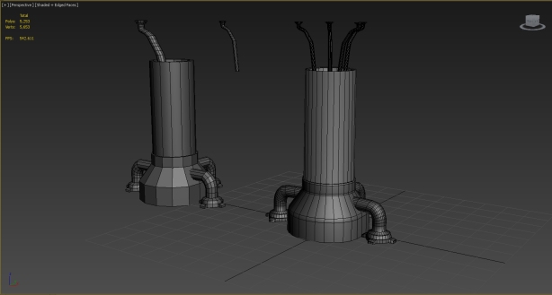
I started by making the basic shape I liked the idea of having it like a giant tube that’s open at the top with pipes hanging in from the ceiling.
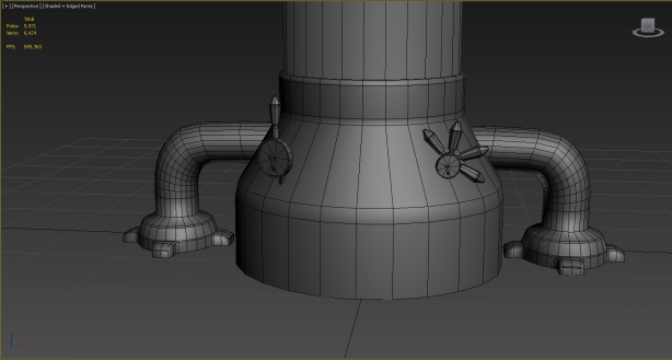
For the monitoring equipment I thought of a more steam powered design having lots of valves and steam chimneys. I then went of to add a keyboard and valves.
I then made a low poly version which I decided not to use and just cleaned up the original.
I am happy with how it turned out but I still have lots to do the texture intensity needs to be toned down, mainly the normal map and AO, and the glass needs to be slightly transparent and have something floating inside ideally I am considering an arm or a leg.
